How To Build A Mobile Website (In 4 Easy Steps)

In October of 2016, the number of mobile and tablet internet users surpassed the number of desktop computer users for the first time ever. This paradigm shift served as a call to action for developers to begin rethinking their entire industry. Since then, mobile usage has continued to grow and become even more prevalent and there are many elegant website development solutions being employed today to serve these users.
These solutions are capable of providing users with a similar experience they would get on a desktop without compromising the content or function of your website. While building a site that is capable of creating this experience may seem daunting, it is much easier than you think.
It's so simple, in fact, that we have compiled an easy-to-follow 4 Step Guide to Creating a Mobile Website to get you started.
1. Choose Your Web Design Approach
There are several solutions you can employ to create a mobile-friendly website. While each web design approach has its own adherents who will tell you it is the best, you should determine which one suits your needs based on your own consideration of the information.
Responsive Web Design
Responsive web design (RWD) employs adaptable layouts that are made possible through the use of proportion-based media, extensions, and backend grids. This means that if a browser window is expanded or contracted, the content will follow it and adapt as appropriate. The result is a website that looks similar on both desktop and mobile.
This plastic user interface is often compared to water. You can pour a cup of water into a glass, a pot, or a jug and the water volume will remain the same, despite the change of vessel.
Adaptive Web Design
Unlike RWD, adaptive web design (AWD) does not rely on a single changing layout. Instead, it uses distinct layouts for different devices and screen sizes. This means that when you log on to a website, you are served the page that best meets the needs of the device you are currently using.
As an example, some may choose to create three websites: one for smartphones, one for tablets, and one for desktops. This would require three different designs, which would remain "on standby" until called upon by each visitor. Instead of a one-size-fits-all website, an AWD acts as a customized gateway for all users.
The approach you choose for creating your mobile website is only the beginning of the design process.
2. Use a Website Builder or a CMS
Once you determine how you want your website to function on different devices, you are ready to begin building it! The platform on which you create your site is instrumental in employing your mobile design plan. For basic users, there are two options to consider.
Website Builders
Website builders take all of the guesswork out of web design and allow you to create a fully customizable and feature-rich website in just minutes. They achieve this allowing users to choose a theme or template and simply drag-and-drop features they like onto their web pages and easily remove the ones they do not.
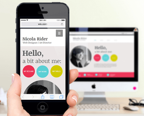
Most website builders, including the gold standard Wix, allow users to simply determine how their sites will react on mobile. The Wix platform mostly relies on adaptive websites, whereas other services like Weebly mostly rely on responsive design. Depending on the kind of approach you envisioned for your site, you may decide to go with a website builder that can accommodate your needs.
Content Management Systems
A content management system (CMS) is your best alternative to a dedicated website builder. CMSs such as WordPress rely on slightly more computer and internet knowledge, but they can provide more features than website builders. Additionally, a CMS offers both RWD and AWD designs.
Similar to website builders, a CMS can take advantage of either mobile design approach by integrating them into the multitude of themes available to users. These themes can be just a rich as those found on website builders, but they better serve those who don't mind getting their hands a little dirty and learning a bit about web design.
If you decide to use a CMS, you can simply download a mobile-ready theme, either for free or for a fee, and use it to create your website. Most of these themes come with full support and regular updates, so you don’t have to worry about maintaining and managing your website.
3. Design a Mobile Website

Upon determining what platform you will build your site upon, you are ready to design and create your website. Whether you are creating a blog, a portfolio, a business site, or even an eCommerce store, you can go about it using the standard principles necessary for any site design. Once you complete your design, you will either have to simply test your site to see if it is responding properly (RWD) or create another design for mobile (AWD).
Designing a mobile website is almost as straightforward as designing a desktop site, but there are a few things you may want to keep in mind.
a. Mobile Users Generally Have Limited Bandwidth
You should always keep in mind that most mobile visitors make use of mobile networks that limit their bandwidth. As a result, it is crucial to keep your mobile site light and free of too much content that can eat away at those crucial bytes.
b. Mobile Users Want Relevant Information Quickly
Often times mobile users visit a site to gain pertinent information about the locations they are visiting such as store hours or phone numbers. If this relevant information is not available quickly and clearly, it may result in the loss of a customer. Make sure that your mobile website has quick links to contact information and other relevant data.
c. Mobile Devices Are Less Powerful
Desktop and laptop computers are built with graphics cards and processors that are able to handle a heavy load. While mobile devices are extremely powerful, they are not built in the same way. Instead they forfeit function for form and as a result, they cannot handle processor-heavy content the same way a computer can.
If your desktop site requires this kind of resource dedication, you may want to think twice about serving a mobile audience this same kind of site.
4. Organize Content
When creating a mobile site it is important to make sure that your users are able to access everything on your desktop site while still retaining the ability to work on a smaller screen. There are several considerations you should keep in mind when organizing your content.
a. Mobile First
Mobile First is one of the newest movements in the design world. It stipulates that you need to first design your mobile site before expanding into pages for desktops and tablets. The content you create for your mobile site can also be loaded on the desktop version.
This approach, therefore, is helpful for dynamically served and responsive websites where the content on your mobile version is identical to that on your desktop site.
b. Mobile Second
If you already have a desktop website, organizing the content might be a bit more difficult, although not altogether impossible. First, figure out the elements of your desktop site you need to show on the mobile version.
Gather user data through the standard analytics tools you use and find out:
- The content that is most important to your visitors.
- What mobile users tend to ignore.
- The path your visitors typically take.
Use the insights you gather to know what should and what shouldn’t go on the mobile site. This will help you clean your desktop site up. Then, map out the content path that your visitors will be taking.
After you have a good idea about the visual flow of your site, you can easily lay out the initial design for mobile screens and go right into the mobile website development.
c. Navigation
Mobile phone screens are small. This means that you should minimize the mobile navigation options. Consider using a magnifying glass or the three line (hamburger) menu navicon. Once you are done, test your website on the popular devices used by up to 90% of your mobile visitors.
d. Design for Touch
Since it is impossible to right-click or hover with your fingers on a mobile device, you need to space links on your mobile website to ensure your users don’t accidentally click on the wrong links. Do this by:
- Giving feedback whenever the screen is touched.
- Using buttons to define where users can and cannot click.
- Redesign your drop-down menus.
- Minimizing text input.
And there you have it! Use this information the next time you need to completely redesign your desktop website for viewing on mobile devices, or when you are creating a new mobile site from scratch.
About
Top-WebsiteBuilders.com is a comparison resource for users. We provide extensive analysis on cutting edge web technologies, and make it easy for users to compare and choose a service that suits their needs.